
Visual Analytics for Health Data
A reproducible workflow and interactive dashboard for exploring complex longitudinal healthcare data in a more accessible and efficient way.
Initial situation
Longitudinal healthcare data offer major potential for research, but they are often heterogeneous, technically demanding, and difficult to analyse without extensive preprocessing. This creates a barrier for researchers and clinicians who want to explore disease trajectories, ageing processes, and patient-related patterns.
Project goal
The goal of this thesis was to develop an analytical environment that combines reproducible data preparation with interactive exploration. The project focused on transforming raw RAI-NH assessment data into an analysis-ready structure and making it usable through a dashboard that integrates statistics, visual exploration, and basic machine learning.
Context & Setup
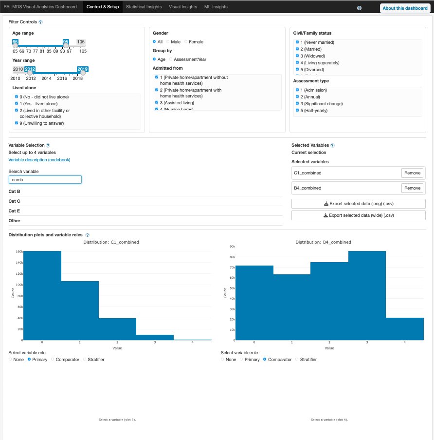
Entry point for selecting analysis context, variables, filters, and the overall setup for downstream exploration.
Statistical Insights
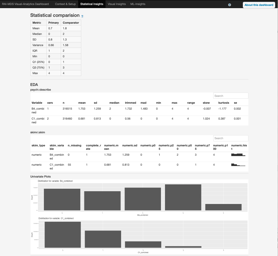
Compact descriptive summaries and structured outputs for understanding the filtered dataset at a glance.
Default Visual Insights
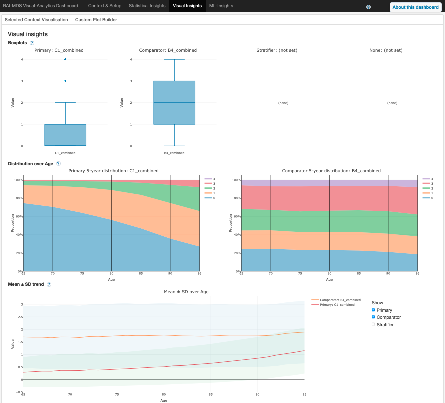
Predefined visualisations that support fast identification of patterns, trends, and subgroup differences.
Custom Plot Bilder
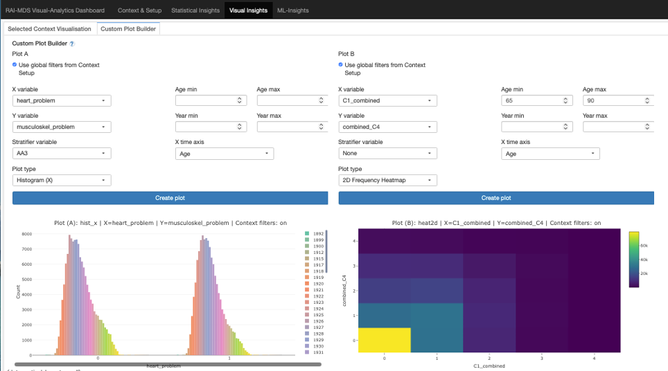
Flexible plot builder for tailored visualisations adapted to specific research questions and exploratory needs.
ML Insights
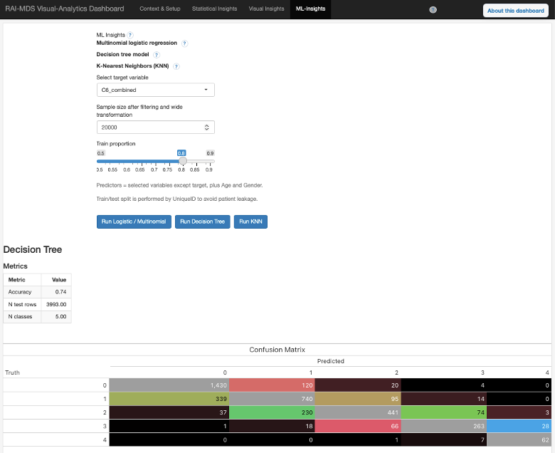
Exploratory machine learning module with basic classification models, confusion matrices, and interpretable outputs.
Solution developed and its benefits
The project delivered a reproducible workflow and a Shiny-based visual analytics dashboard that bring data preparation, exploratory analysis, and communication into one coherent system. Users can interact with prepared longitudinal data without having to build the full preprocessing pipeline themselves.
- reproducible transformation of raw healthcare data into an analysis-ready format
- interactive filtering and subgroup comparison across repeated assessments
- integrated statistical summaries and predefined visual insights
- custom plot generation for tailored exploratory analysis
- basic machine learning models for exploratory predictive insights
- exportable outputs that support further analysis and interdisciplinary communication
- reduced technical barriers for users with different analytical backgrounds
In the usability evaluation, the dashboard achieved a mean System Usability Scale score of 82, indicating excellent usability. In addition, the exploratory machine learning module showed predictive accuracies above 70%, suggesting meaningful patterns in the prepared data.
Project outcome
“The work demonstrates how complex longitudinal healthcare data can be transformed into an accessible analytical environment that supports exploratory research and interdisciplinary collaboration.”
Bachelor thesis summary
Key terms
- Visual AnalyticsInteractive exploration of healthcare data
- Longitudinal DataRepeated assessments over time
- Reproducible WorkflowStructured and transparent data preparation
- Shiny DashboardIntegrated analytical user interface
- Machine LearningExploratory predictive modelling
- Usability EvaluationSUS-based assessment with user feedback
Customer

University of Zurich (UZH)
Dr. Ania Mikos
Andreasstrasse 15
8050 Zürich
https://www.hlc.uzh.ch/en.html

Klinik Barmelweid
PD Dr. med. Mathias Schlögl
Klinik Barmelweid
5017 Barmelweid
https://www.barmelweid.ch
Team
Mojžiš Suna
Advisor
Prof. Dr. Arzu Çöltekin
Rahel Ganarin